The Before and After Series: Part Eleven

A Tired '80s Valley Retreat Turned Rustic Contemporary
On a recent Sunday morning I had the pleasure of visiting my clients’ Sleepy Hollow home for the first time since they embarked on a significant remodel. The prior home was truly unrecognizable now! It was beyond exciting seeing the finished product, sipping mimosas and hearing their story.
I met the buyers back in my former life as a recruiter up in San Francisco. We kept in touch for many years and the next thing I knew, we were on the hunt for a Carmel Valley weekend getaway. Land and privacy were their goal. But after one hot day in 2016 touring properties in Cachugua, and getting a bit car sick along the way, they realized that being closer to Carmel Valley Village was essential. Realizing I was striking out fast, I made a last ditch effort to show them a newly listed home behind the gates of Sleepy Hollow. And here we found just what they were looking for.
Built in 1982, this 8 acre hilltop property housed families and pool parties in its hey day but it was now tired, and in need of repair. After an aggressive negotiation, my clients closed escrow about two months after they first saw the home.


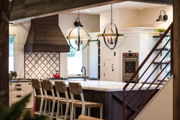
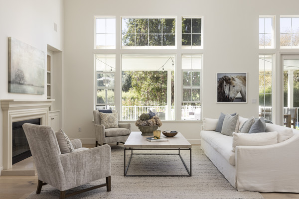
Shortly after closing, they hired Groza Construction and Michelle M Chu Interiors to make their vision a reality.They updated every square inch of the home but the most significant change was opening up the floor plan to create a magnificent great room. From the entry, past the dining, family room and through to the kitchen, walls were taken down or minimized and a staircase was artistically exposed.


With careful consideration to reuse materials whenever possible, they were even able to reclaim some wood on the property to use throughout the interior. For instance, an old closet turned into a wooden countertop at one side of the giant kitchen island. Some details were left in tack, like the dumb waiter between the garage and kitchen, but the pantry was moved to allow for new windows on each side of the stovetop.


Just like the rest of the house, the master bathroom did not even resemble the skeleton of its old self. Gone were the ‘80s tile and in went a sleek marble-like quartz and clean subway tile.


The master bedroom sitting area is also distinctively unrecognizable. They uncovered beautiful brick under the old fireplace facade and with a whitewash treatment, gave the room depth, texture and color.


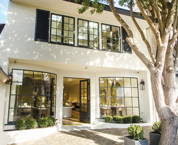
The original house lacked some serious curb appeal, so that was also top of mind when it came to the remodel. This led them to replacing the front door, garage doors, adding a trellis over the garage and installing new windows throughout. They also resurfaced the pool, added a stainless steel hot tub and installed a new solar system on an overhang covering the outdoor dining table. Furthermore, they trimmed brush away from the house for added fire safety. The owners are now focused on the final touches on the exterior, including a hobby vineyard and landscaping with native, drought tolerant plants.
Before photos taken by Ryan Rosene, After photos taken by Sherman Chu.
Vacation Itinerary for a Weekend in Carmel
NAR Settlement
What's Changing About Real-Estate Commissions?
I want to address the National Association of REALTOR®s' recent settlement to resolve a class action lawsuit that has been in the news so much this year. One of the settlement terms is that the MLS will no longer allow for listing agents to make offers of compensation to buyer’s agents, which is how it has traditionally been handled. To comply with this settlement, the MLS removed all offers of buyer’s agent compensation as of Tuesday, August 13th.
Commissions always ...
Modern Luxury in a Carmel Jewel Box
Fourtané Jewelers Opens a Beautiful New Boutique
The AT&T Pebble Beach Pro-Am Evolves
The Tournament's Exciting Transformation
"It was truly a treasured invitation," he says. "It's impossible to play center fi eld in a professional baseball game, but you can be part of something special with the Pro-Am."
A mainstay of the Monterey Peninsula for almost 80 years, the tournament has been officially ...
The Before and After Series | Part Seventeen: Valley Estate Perfected
I had been referred to potential buyers who were relocating to Carmel from Colorado. They were the type of buyers that could be successful in the crazy days of COVID. Decisive, ready and able. It was March, 2021 and a gorgeous four bedroom home on one of my favorite streets in Carmel Valley had just hit the market. I called my clients and the husband literally hoped on a flight the very next morning. He boarded a plane with only a cup of coffee in ...


